Signature
Identify the primary mark, its variants and their conditions of use.
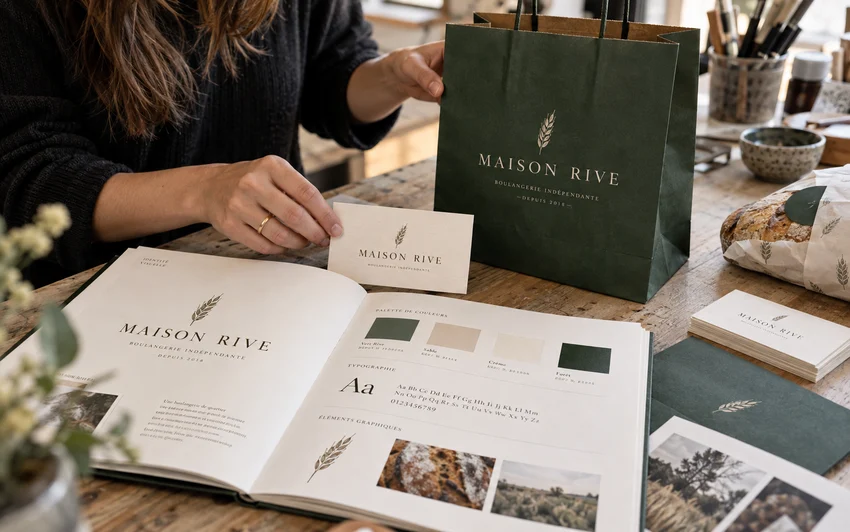
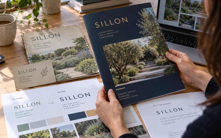
An identity is more than a symbol. We design a language that works on a screen, a card and a document. The logo, colours, typography and composition rules work together as a recognisable, usable system.
A strong identity should remain recognisable when its size, medium or audience changes. We therefore design the mark together with its surroundings: typography, colour relationships, spacing, hierarchy and the way text and images work together. Each decision relates to situations in which your brand will actually be used.
Two initial directions allow you to compare different intentions. Once one is selected, we develop it and check it across three applications agreed in the brief. The guide explains useful rules for creating consistently; it does more than assemble attractive boards. You receive an organised system that is straightforward to understand.
One brand identity: two initial directions, development of one selected direction and three simple graphic applications.
An example contents plan connecting each group of rules to a practical decision.
Identify the primary mark, its variants and their conditions of use.
Distinguish headings, body text and secondary information.
Define selected combinations for light and dark backgrounds.
Demonstrate the system across the three applications agreed in the brief.
The primary logo is accompanied by variants that the project actually needs: another format, a monochrome version or a version for a particular background. SVG, PDF and PNG files are organised by use to avoid inappropriate substitutions.
The guide, up to 20 pages, brings together colours, typography recommendations and composition rules. It explains the selected combinations and common mistakes to avoid. Any font licences are identified separately so their conditions remain clear.
The three agreed applications act as practical tests: for example a card, graphic signature and cover. They demonstrate how the system works. Quantities, dimensions and editable delivery formats are confirmed in the quotation.
We explore two directions from the approved brief and explain their intentions. Comparison focuses on brand expression and practical use rather than an isolated colour preference.
The chosen direction becomes a system of mark proportions, typography, colours and composition rules. Two consolidated feedback rounds refine that direction without multiplying concepts.
We check consistency across the three selected applications and organise the exports and guide. You know which file to use and when another adaptation needs to be discussed.
Vector exports and the agreed applications can be prepared to constraints known at the brief stage. Printing, final paper selection and technical manufacturing approvals are not automatically included in this offer.
The project develops one selected direction. Unselected proposals do not become additional identities delivered for use. The quotation specifies the files and rights agreed for the final creation.
Tax-inclusive starting price for the described scope. Two consolidated feedback rounds on the selected direction, except brand direction: one clarification session.
After a confirmed start and receipt of the required materials. Excludes waiting for approvals. The quotation confirms dates, rights and the total price.
Describe my project